OVERVIEW
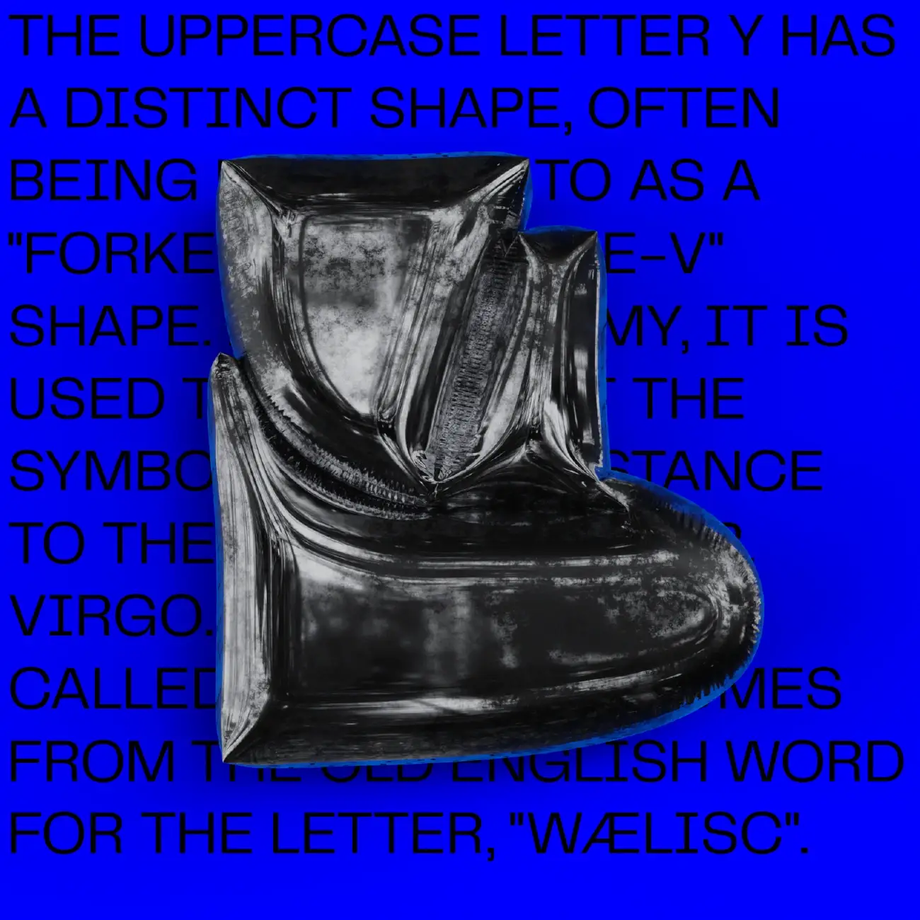
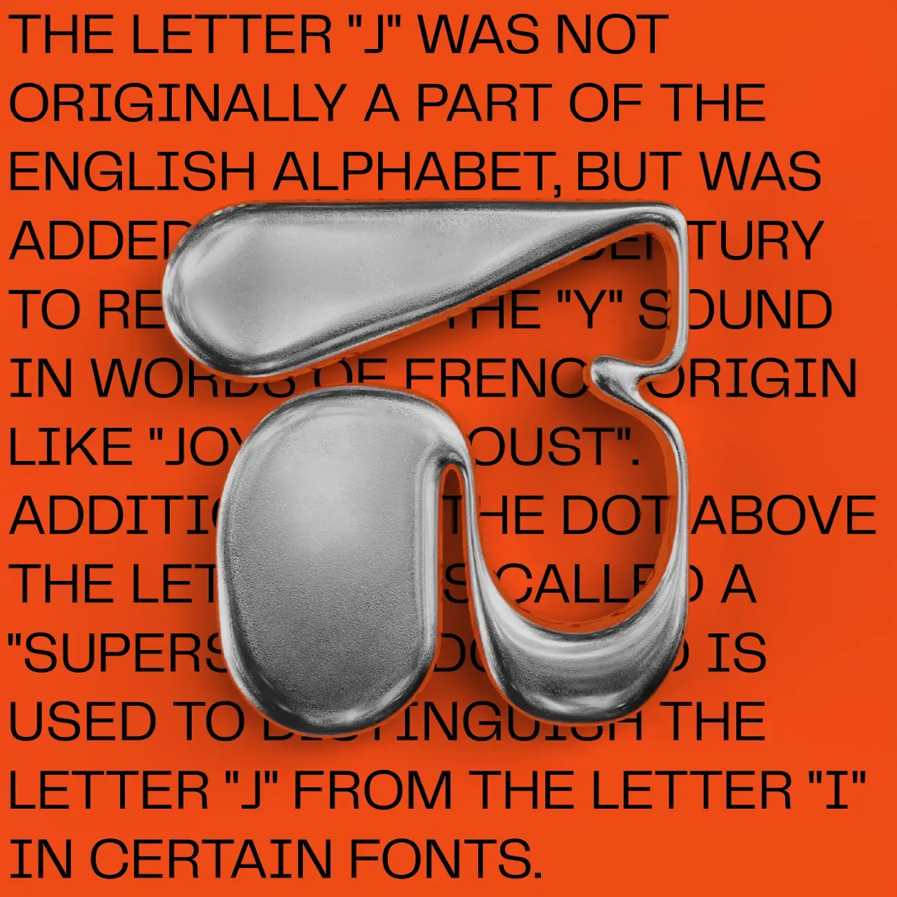
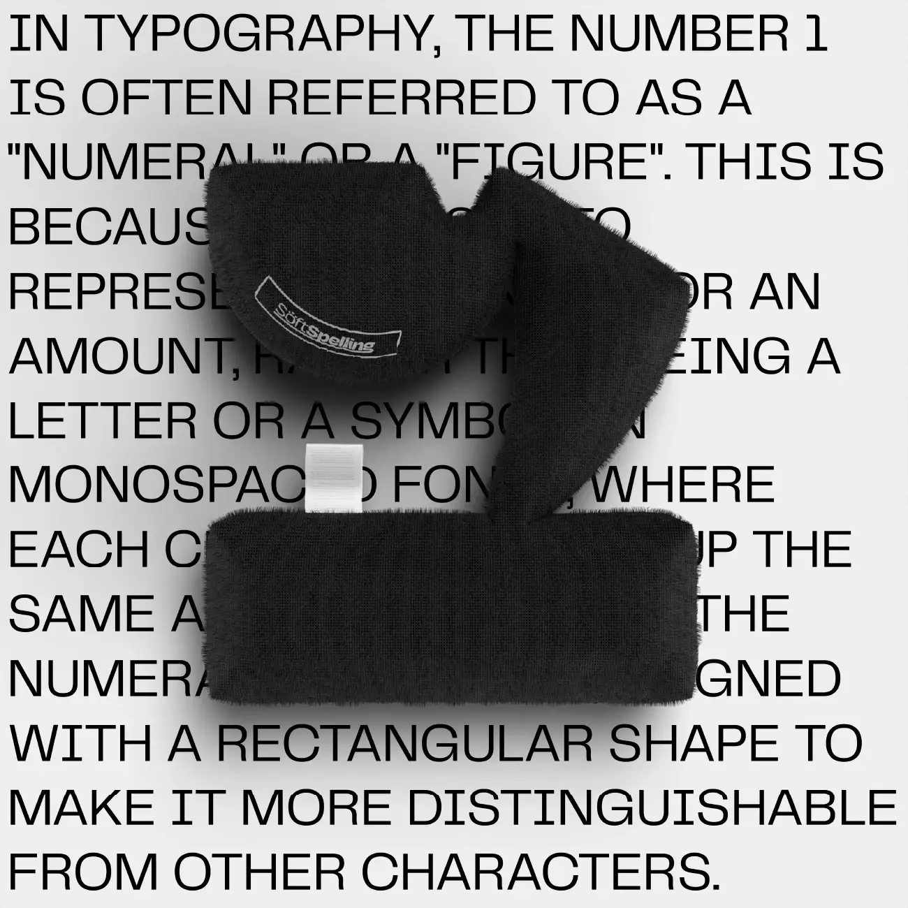
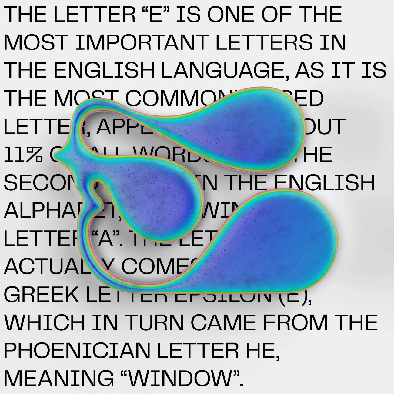
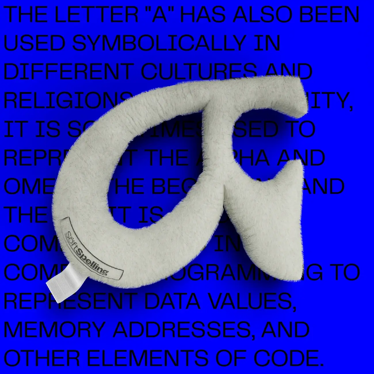
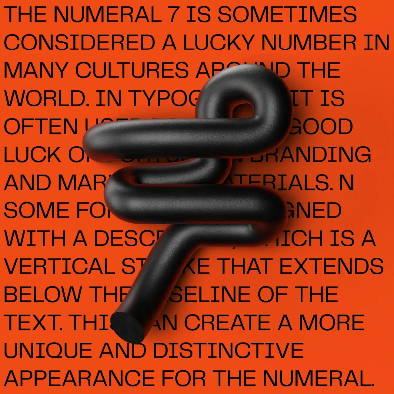
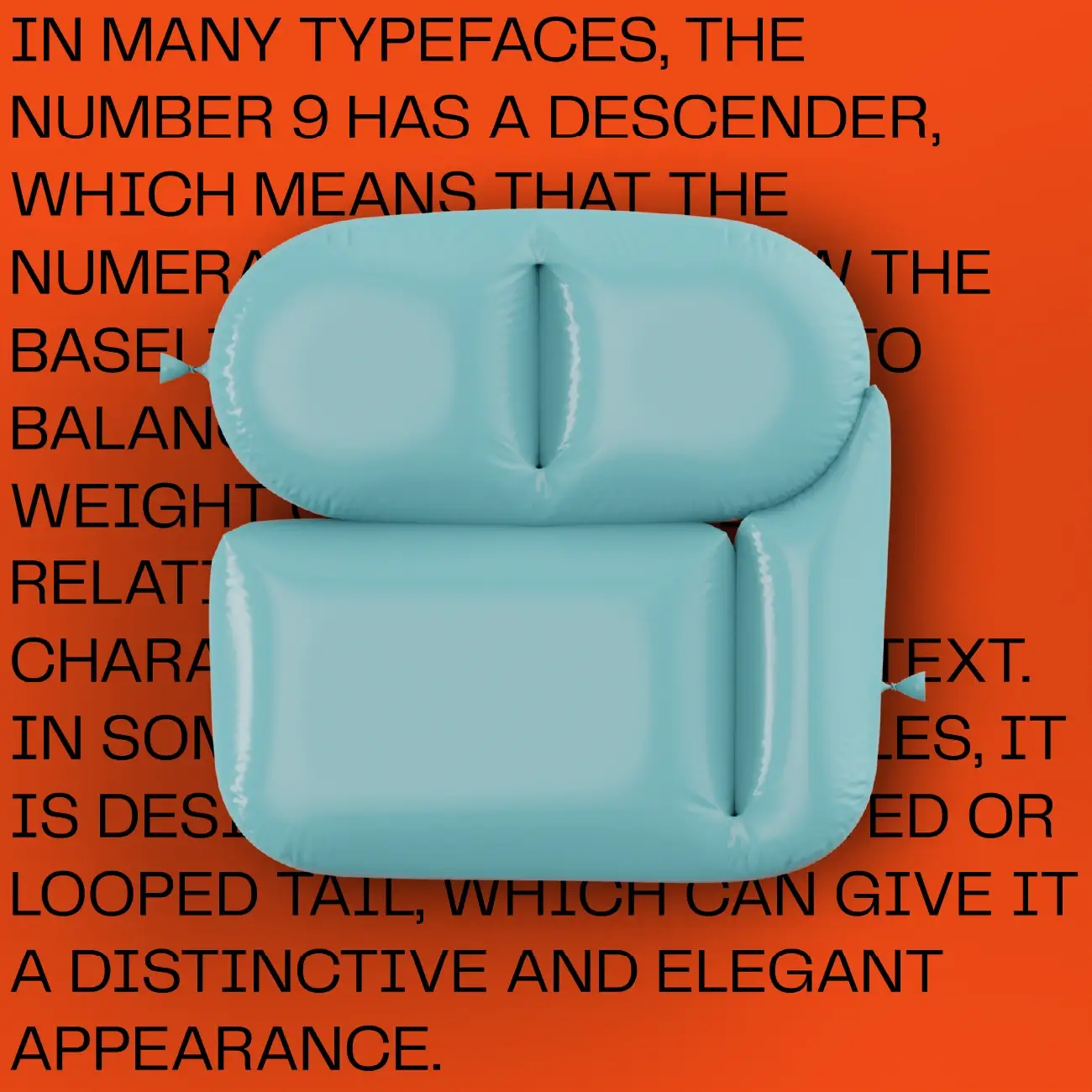
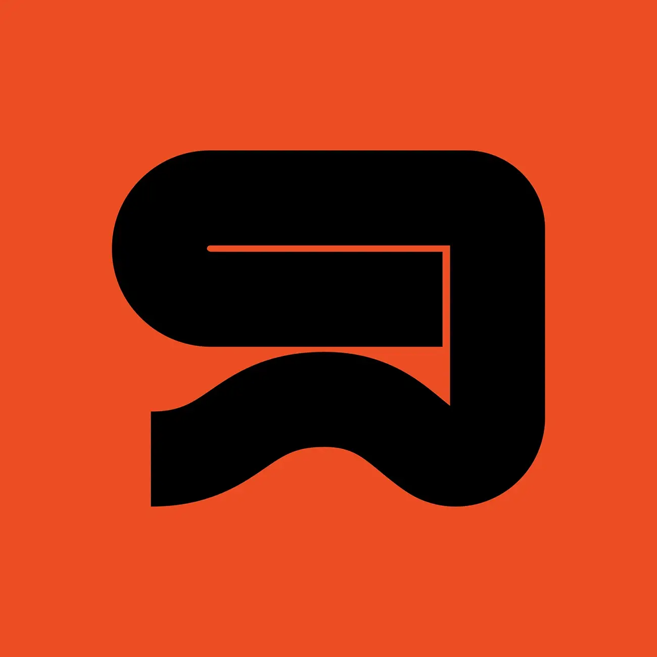
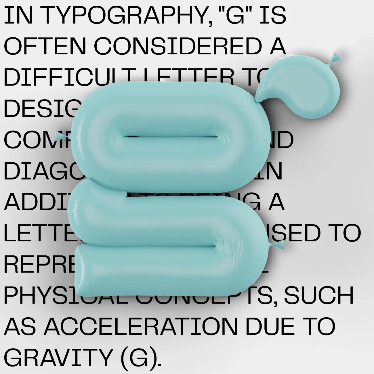
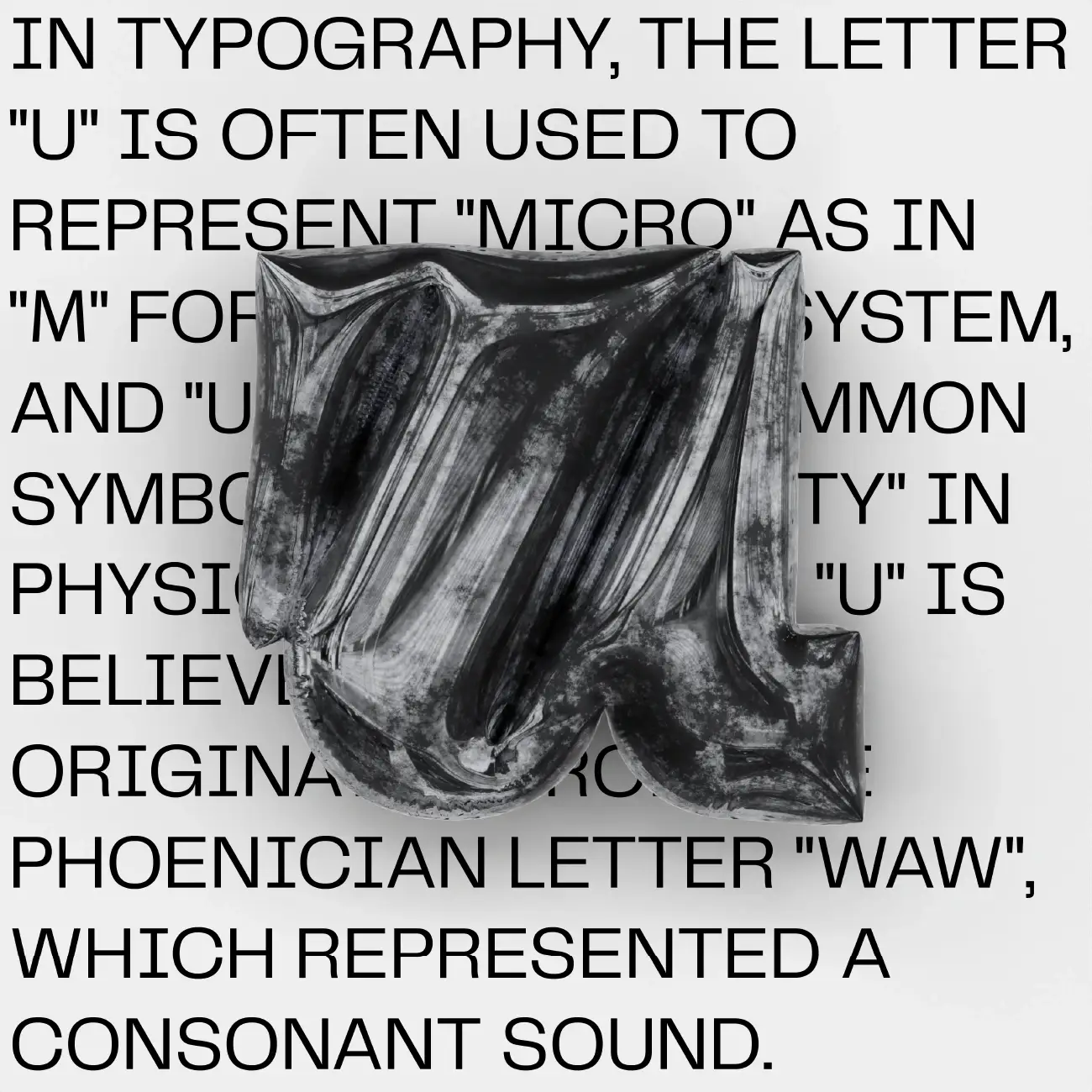
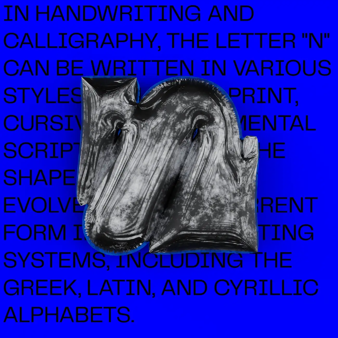
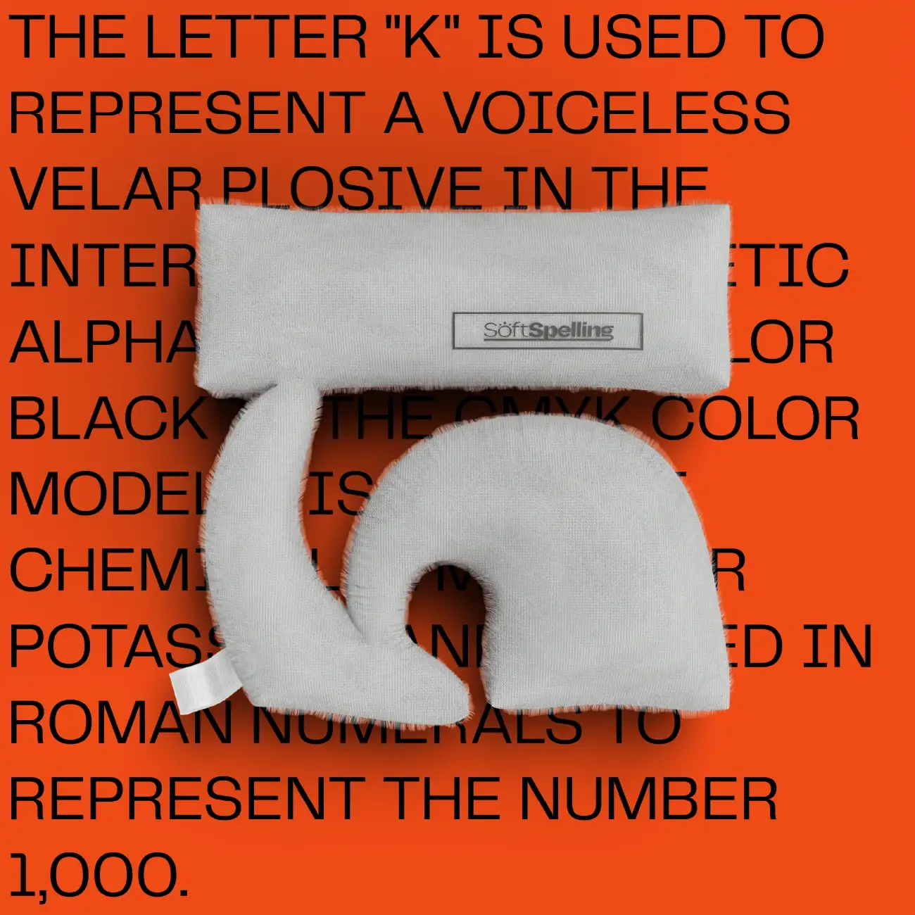
36 Days of type is a challenge where graphic designers and other artists have to reimagine the English alphabet from a to z and the letters from 0 to 9. The style for the project I chose a 3D style where I combine the alphabet with their actual meaning and origin written in the background. At first I designed the letters in a 2D space then I imported it to Blender where I shaped and distorted it. The 3D modelling a lighting was pretty challenging due to I wanted to kepp the clean look of the background. All in all I was pretty happy with the result. Hope you like it as well!
